Numbeo is kind enough to report their Cost of Living Index for countries of the world so we can take a look.
- Copy and paste into DataDesk.
- The column heads will need tweaking: start your copy with the data.
- Then when you paste the data into DD use the Prompt for Each Variable Name option to name the variables. You can leave out “Index” in the names; it doesn’t add much. And pick short names like COL for Cost of Living.
We can take a quick look:
Let’s make a rotating plot of COL, Rent, and Groceries.
Rotating it around, you can see that it is rather flat, indicating that there are not really 3 dimensions here—COL depends on the other indices.
Also, notice one country sticking out (I’ve marked it with a red X)
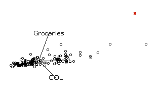
Identify it. (Be sure the Countries variable is open and just click with the ? tool)
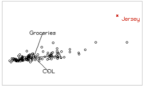
Jersey? I don’t think I know that country.
But I can look it up. With that point selected, choose Special > Web Search Query.
Data desk passes the name “Jersey” to Google (or your choice of search engines)
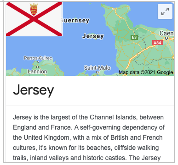
Oh, that Jersey
If we want to make a regression model, we’d best check the distributions of the variables.
Make a histogram (click the histogram button in the toolbar)
Then drag in each variable in turn; a quick way to look through them
For example:
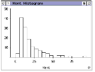
They are all skewed right—no surprise for data on 139 countries
Re-expression by logs should help.
Select all the data icons and press the “L” key – that’s a shortcut for taking logs.
If you like menus better, the command is Manip > Transform > Log(y)
Click the Regression button in the toolbar.
Drag LCOL in as the response variable and the other variables (except COL + Rent, of course) as predictors.
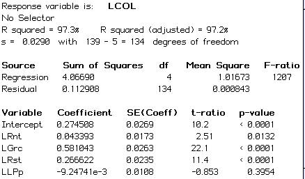
Of course, we then plot the residuals (the command is in the global hyperview in the title bar)
I like externally studentized residuals for multiple regressions – a topic for later.
But any residual plot will do here.
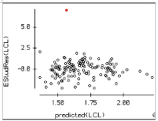
I’ve colored the outlier red. Identify the outlier using the ? tool. Be sure to open the Country variable first.
The outlier is Ethiopia.
I suspect the data for Ethiopia may not be all that reliable. Let’s set it aside.
The easiest and most honest way to do that is to make an indicator variable for Ethiopia:
Select the point (use the hand pointer tool)
Modify > Selection > Record as Indicators
Will make a variable named “Ethiopia” (You do still have the Country variable open, right?) that is 1 for Ethiopia and 0 for all others.
Drag this variable into the regression table and drop it there.
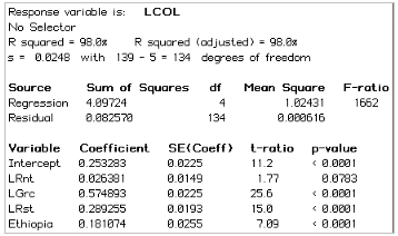
The large t-ratio (6.99) and significant p-value are a test of whether Ethiopia was an outlier, re-assuring us that it should be set aside.
Now our attention is drawn to the high p-value for LLPp—Log local purchasing power.
Let’s look at a partial regression plot to see what’s going on.
Click on the coefficient to drop down a hyperview menu and choose Partial Regression plot of LLPp.
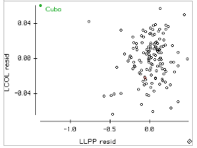
There is an outlier. I’ve colored it Green. Identify it and see that it is Cuba.
Why is it an outlier? Well, we could make a parallel coordinate plot for the predictors:
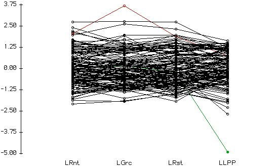
Jersey is still colored red; we can see that it’s the cost of Groceries there that sticks out. Cuba, still colored green, has a very low Local Purchasing Power.
We could make an indicator for Cuba and add it to the model, or we could just omit LLPP from the model. The partial regression plot suggests it really isn’t contributing much. And, in fact, the R2 doesn’t change when we omit it:

The residual plot now looks reasonable.
We could do more, but this is a good place to stop.
Recent Comments