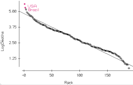
How should we look at covid data? Use Zipf’s law. Plot the log of the counts by country vs the rank order. Remarkably, most of the plot will (usually) be straight. You can judge how extreme the top and bottom are by comparison with the line.

USA is the worst in the world—but much worse than would be expected of the maximum. Brazil isn’t much better.
This is easy to do in Data desk.
-
Select the variable (Deaths)
-
Press L (shortcut to take logs) to make the LogDeaths variable
-
Choose Manip > Rank
-
Click on the Scatterplot button in the toolbar and drag in the variables
Open the variable naming countries so the ? tool can ID them.
Recent Comments