Gain more perspective
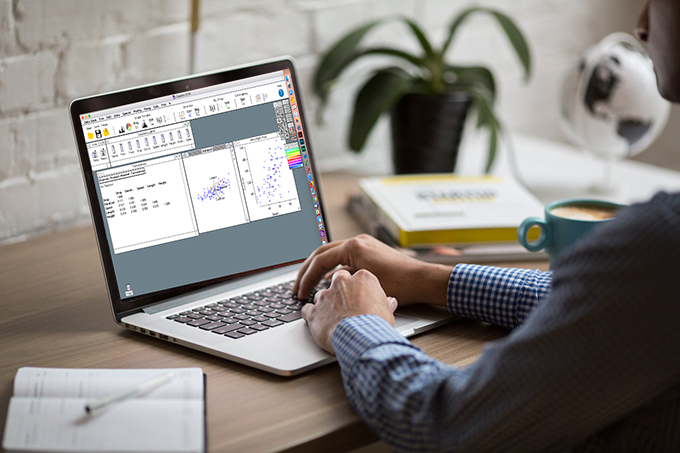
Beyond the most trivial cases, there is little value in blindly applying formulas to data. Real world data analysis is a multi-step process, and Data Desk speeds up this process by allowing you to select suspicious-looking outlying cases in one visual, and keeping your point selected as you change visualizations. Spot outliers and trends at a glance.
By allowing users to quickly re-express data in different ways, Data Desk encourages experimentation and composition to create more compelling models. Select and categorize data across different visualizations in real-time
What kind of Data Analyst are You?
- I use state-of-the-art tools to explore, clean, and understand my data.
- I sometimes deal with millions of cases and need a program with the power to deal with that much data on my desktop.
- I rely on data visualizations to see what’s going on in my data; animations, plot rotation, and linked plots are what I’m looking for.
- I’m still learning R, but I use it for most of my data analysis work.
- A graphical interface for R would save me time and simplify my work.
- Especially if it cleaned up datasets to make them R-compatible.
- I’m a data scientist programming in Python for my data analyses.
- A graphical interface that wrote Python commands for basic statistics and graphics would boost my productivity.
See how Data Desk can become part for your workflow
Try Data Desk’s R export features
Try Data Desk’s Python export features

Welcome to Data Desk RP

Wrestling with R and Python Coding?
Take advantage of the R & Python Export Function
Make plots and perform sophisticated analyses with Data Desk’s graphical interface, then just click to export the R or Python code that reproduces what you’ve done.
Data Desk cleans your data to R’s standards (no choking on stray characters).
Comments you make in your Data Desk windows appear as comments in your code.
In short, Data Desk does the work for you. You just point, click, and drag.
Hard to believe you can code without even touching a keyboard? Watch the video.
You can even paste the code for a plot or analysis into an existing R or Python program.
Students can get started using R or Python more quickly and with less pain.
Instructors can spend less time teaching coding.
Everyone can spend less time debugging.
Data Desk RP levels the scripting learning curve.
-Use R and Python with a simple graphical interface.
-Don’t even touch your keyboard for most basic statistics graphs and functions.
-Expect idiomatic, clear code
You can determine your own analyses easily and then see how to do the same thing in your scripting language of choice. Then you can modify the code further, with a great launching-off point.
DDRP allows you to use R and Python with a simple graphical interface. Don’t even touch your keyboard for most basic statistics graphs and functions.
R Users:
Want to learn Python? Data desk writes both R and Python so you can see the R and Python code side-by-side.
There is no need to post code for your students to copy and paste. When they do that, they don’t learn as much and they don’t think about their analyses. Now students can do their own analyses in Data desk and transparently transfer them into code. You can assign analyses and suggest modifications and options they can try with the resulting code. If your students have started with another statistics program, this will ease their transition to scripting languages.
Explore, plot, and analyze your data with Data desk’s dynamic graphics and fast computing. Then record the part of your analysis that you want to document, save, or communicate to others as a program.
Clean and convert your data more easily. Data desk accepts any variable names and any data contents and will clean your data to R standards when it exports the data. Missing values become “NA”, “illegal” characters in variable names and data are replaced, even duplicate variable names are OK in Data desk and will be modified when sent to R.

Nobody Does it like this.
For over 30 years Data Desk has helped you discover both patterns and the points that don’t fit. Now it does it with more power and speed!
Blindingly Fast Interface
The simplest workflow of any statistics software: select a toolbar icon to make a plot or table window and drag your variables into where they belong. No dialog to fill in, no syntax to remember or look up, no punctuation to get wrong, no debugging.
64-Bit
Generate plots and complex analyses on millions of cases of data instantly. Click and drag variables. Highlight cases across models.
Unique HyperView®
Web Search Query
Select a particular case and activate Data Desk’s Web Search Query to automatically search the case on your default search engine, so you can easily dig up background information.
Explain Components
Input, Clean, Format
DDRP Video Guide Library
The button below will take you to our series of video guides on Data Desk RP